
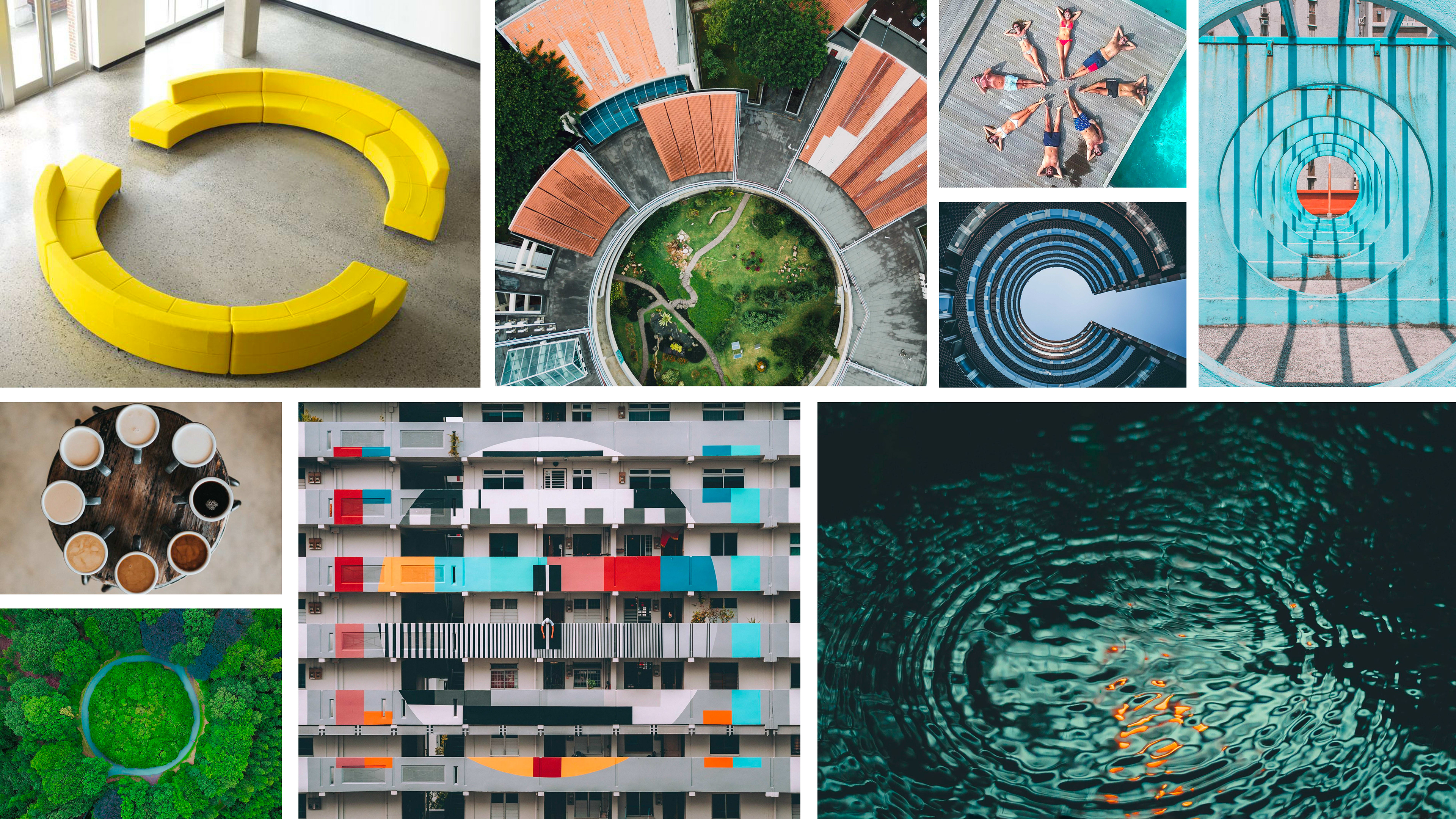
2018 Vrbo Rebrand: Communal Circles
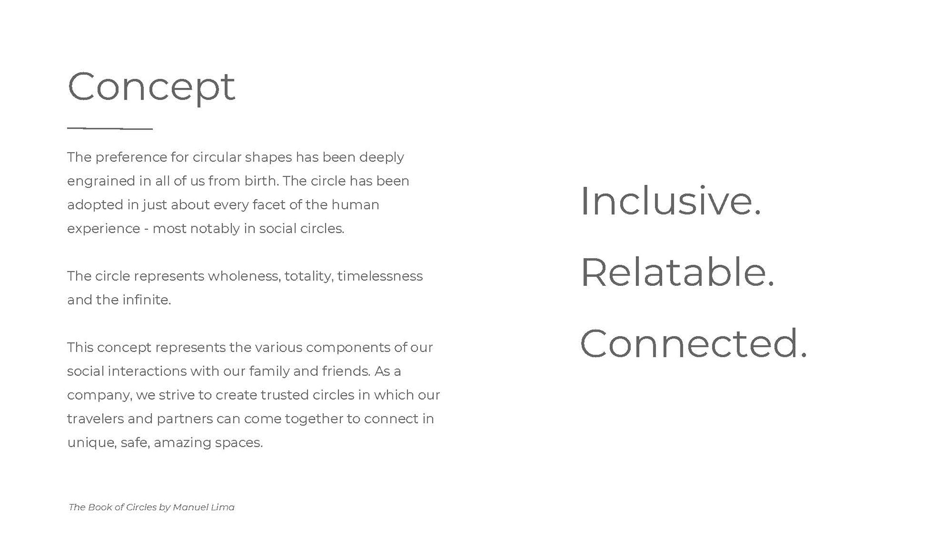
Our internal creative dept. was invited to participate in the rebranding of Vrbo. Along with other creatives, I pitched a concept that fulfilled the goals of the creative brief. My approach to the Vrbo rebrand focused on the heart of what makes travel fun for everyone: inclusiveness, relatability and connectedness. These the elements are crucial in helping us connect and build strong relationships within our social circles.
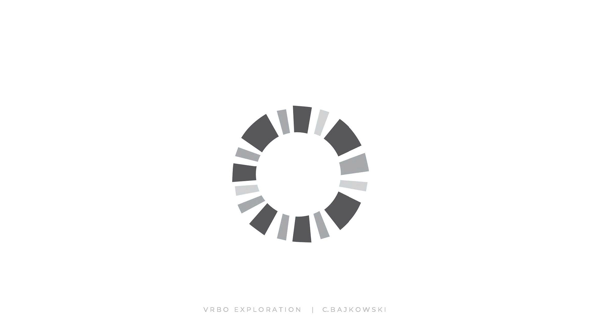
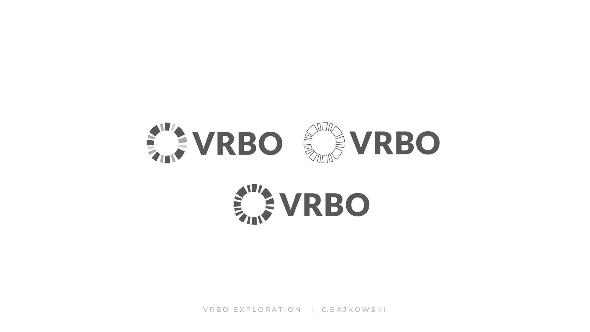
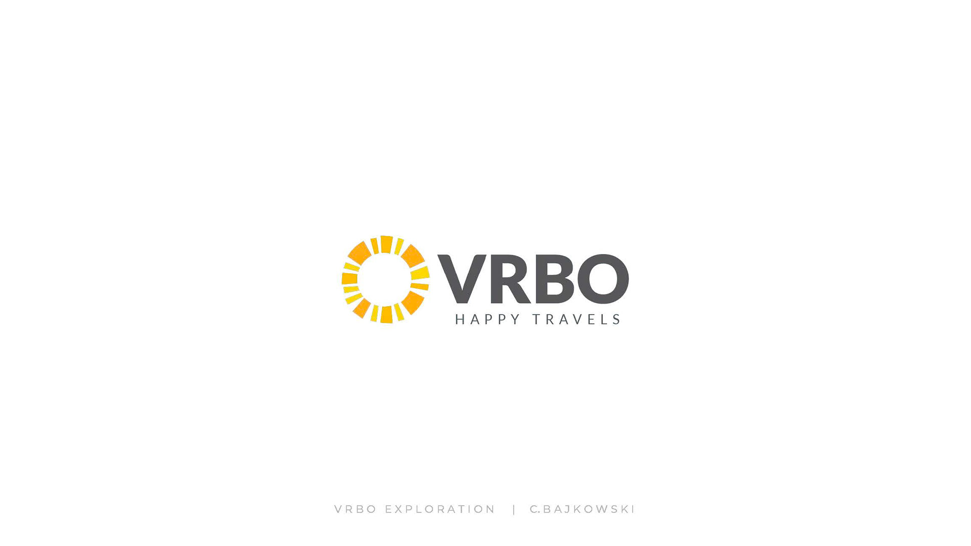
The Logo
Our internal creative dept. was invited to participate in the rebranding of Vrbo. Along with other creatives, I pitched a concept that fulfilled the goals of the creative brief. My approach to the Vrbo rebrand focused on the heart of what makes travel fun for everyone: inclusiveness, relatability and connectedness. These the elements are crucial in helping us connect and build strong relationships within our social circles.
The Logo
The circle itself is made up of a variety of shapes and sizes. The individual shapes symbolize the unique members of our social circles. Our friends or family earn sacred space in our lives that we ultimately assign value and meaning. Without these elements, our social interactions are devoid of the things that build strong foundations for relationships: trust, loyalty, transparency, respect, protection, and support.
The circle also illustrates the energy, force, strength, power of the sun and is a fun and universal symbol for travel.
___________________________
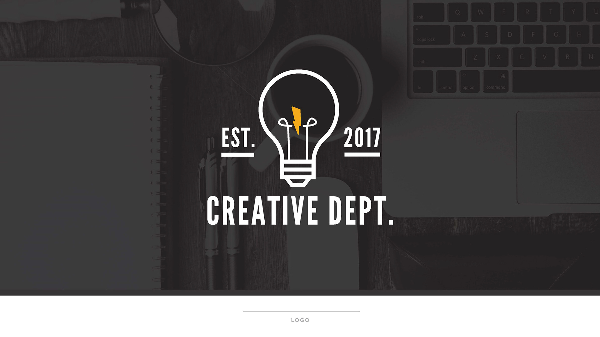
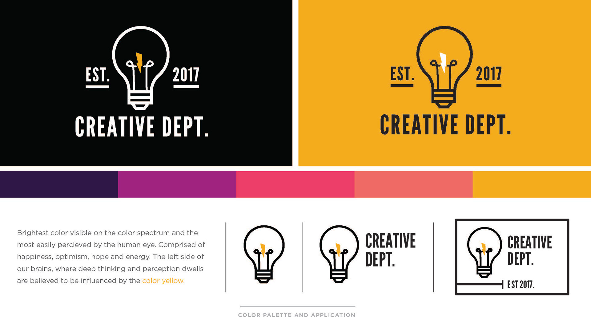
2017 HomeAway/Vrbo In-House Creative Dept. Brand
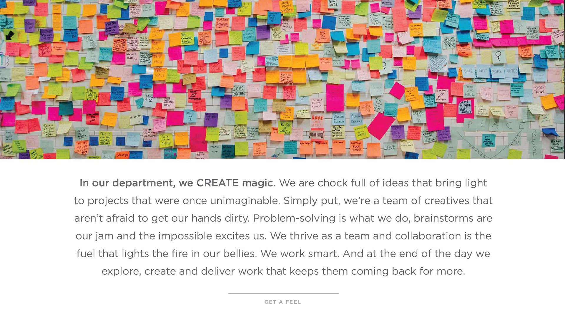
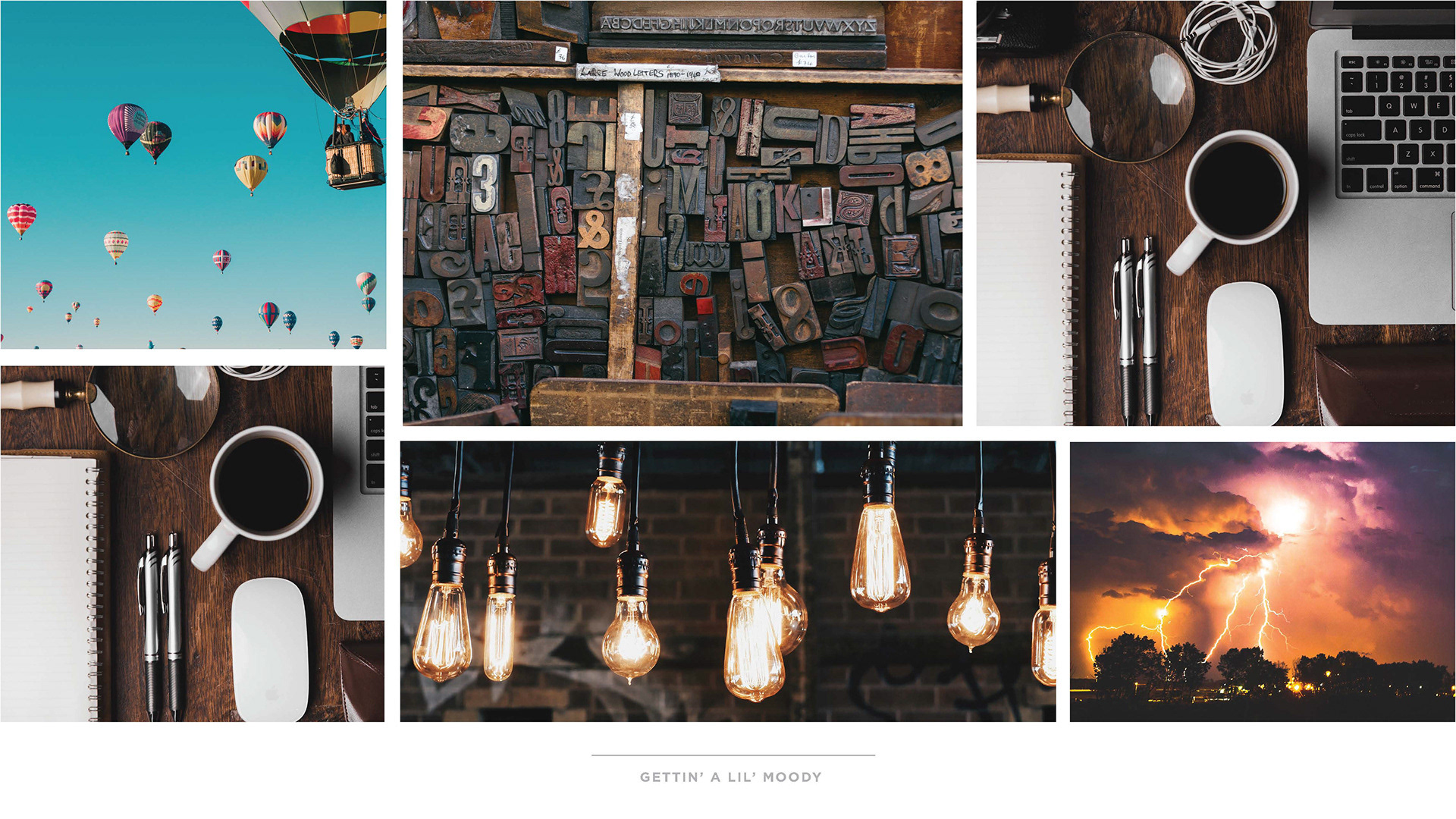
Pitched a new, unique and fun brand for the HomeAway/Vrbo in-house marketing creative group that is representative of an an international, multidisciplinary group of creative experts with a passion for making the impossible possible.
Pitched a new, unique and fun brand for the HomeAway/Vrbo in-house marketing creative group that is representative of an an international, multidisciplinary group of creative experts with a passion for making the impossible possible.
___________________________
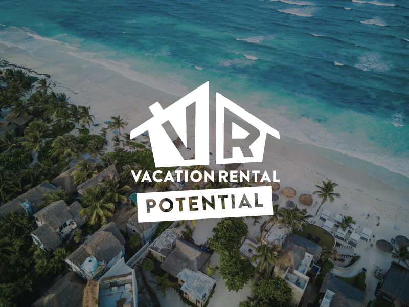
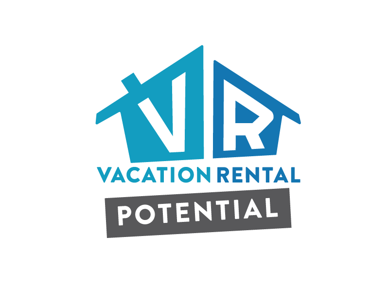
Vacation Rental Potential
Pitched a fresh and exciting logotype for the HomeAway's "Vacation Rental Potential" show on A&E. I collaborated with my colleague Michael Tangonan to design a unique mark that was created to stand out from various real estate shows in rotation on and off the network.
Pitched a fresh and exciting logotype for the HomeAway's "Vacation Rental Potential" show on A&E. I collaborated with my colleague Michael Tangonan to design a unique mark that was created to stand out from various real estate shows in rotation on and off the network.